Round Peg Square Hole
Branding
Social Media
Advertising
Web Design
Content Strategy
Illustration
Over the course of multiple freelance projects, I established a cohesive visual appearance and distinct brand identity for 'Round Peg Square Hole', aimed at helping adults with ADHD embrace their uniqueness. I created marketing materials for social media, print and digital applications with strategic insights, leading to an increase in audience reach, engagement and membership sales.
Challenge
Adults with ADHD in the UK face long wait times for diagnosis, limited support, and widespread stigmatisation. My client founded ‘Round Peg Square Hole’ (or RPSH) after her own late diagnosis to help others like her, but struggled reaching her target audience with a limited budget. The core challenge was creating a brand identity that stood out from established, big organisations.
Insight
My competitor audit revealed that most organisations target a broad audience and communicate with authority to improve education and awareness. RPSH instead focuses on those discovering their ADHD later in life, who have experienced lifelong struggles and issues with self acceptance. The brand needs to serve as an understanding safe space, helping them feel at home in an authentic community.
Impact
A confident appearance, deeply rooted in the founder’s personal experiences, makes this audience feel directly spoken to rather than about. The brand identity was built around humour, chaos and self-acceptance, and served as a foundation for future projects like the launch of a paid community-membership, a monthly newsletter, and a conceptualised board game launch event.
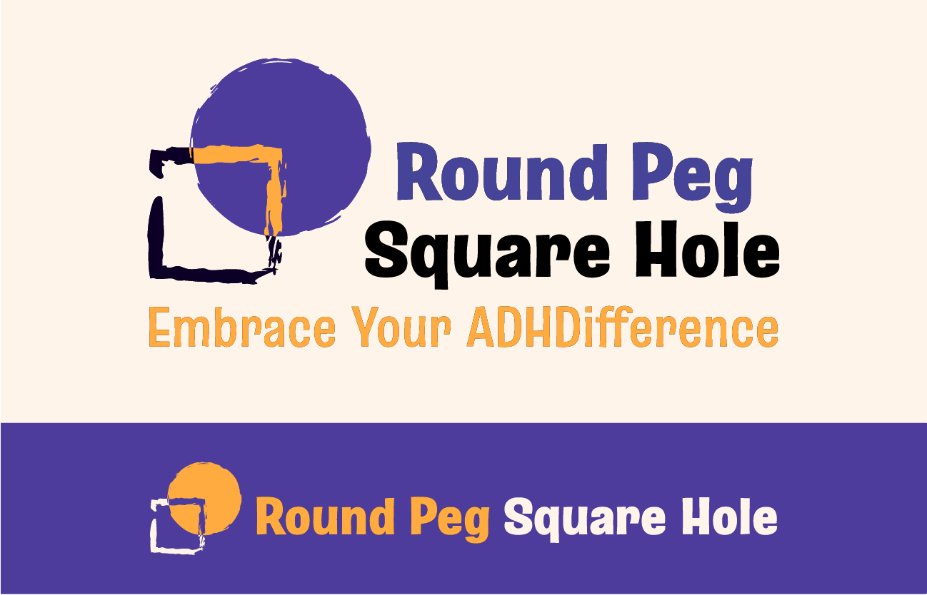
The final logo and claim communicate a key insight behind the brand's name and approach: Those with ADHD feel like they are round pegs in a society made of square holes, as if they cannot fit in without being forced to change or hide parts of themselves. Round Peg Square Hole wants to challenge this societal idea that ADHD needs to be ‘fixed’ and instead focuses on embracing the uniqueness of those affected.
Brand Identity
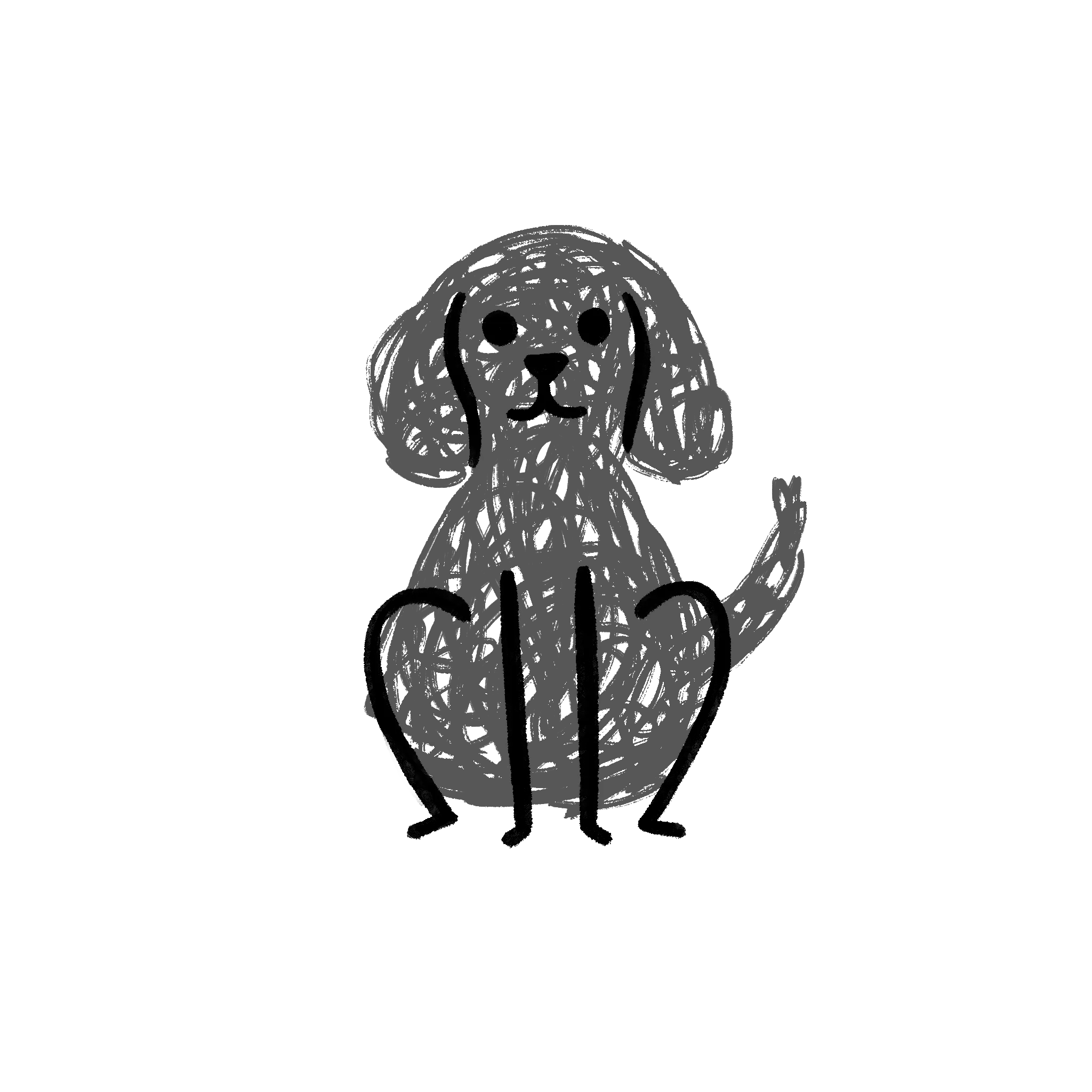
Bonus illustration of the founder's dog

To further separate RPSH from the clinical and impersonal approach of most competitors, we decided to include mascots with distinct personalities resembling common experiences of people with ADHD. I illustrated them in Procreate, taking care to balance a scribbled and creative appearance with legibility of facial expressions.
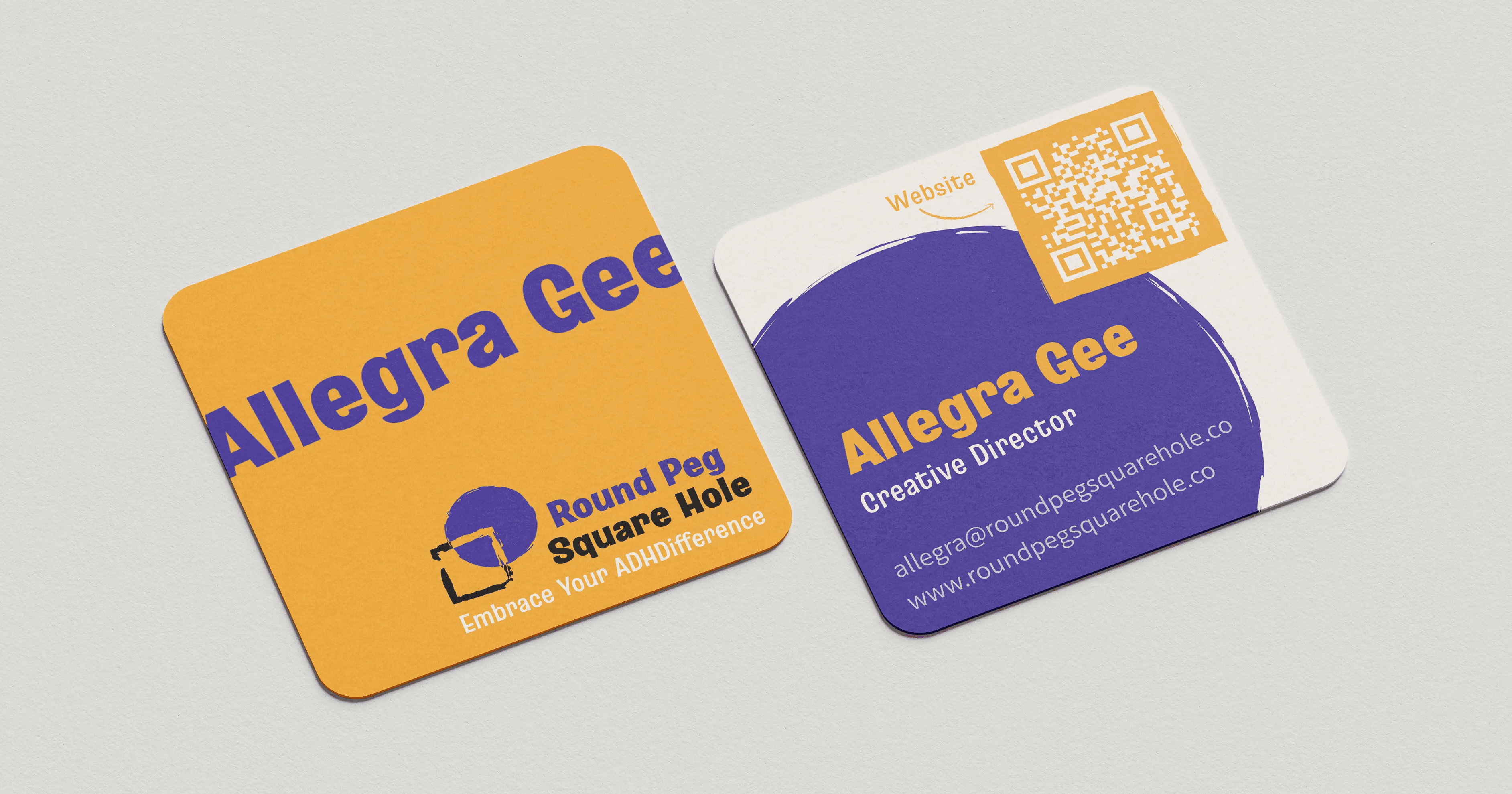
Colours, typography and shape language were all chosen to reinforce this authentic appeal of boldly embracing imperfections and creativity. The business cards I designed show this in the use of rough shape edges, slightly slanted headlines, and elements being cut off by the edges of the cards. All shapes used in the brand appearance also stem from the original circle and square from the logo for further cohesion and recognisability.
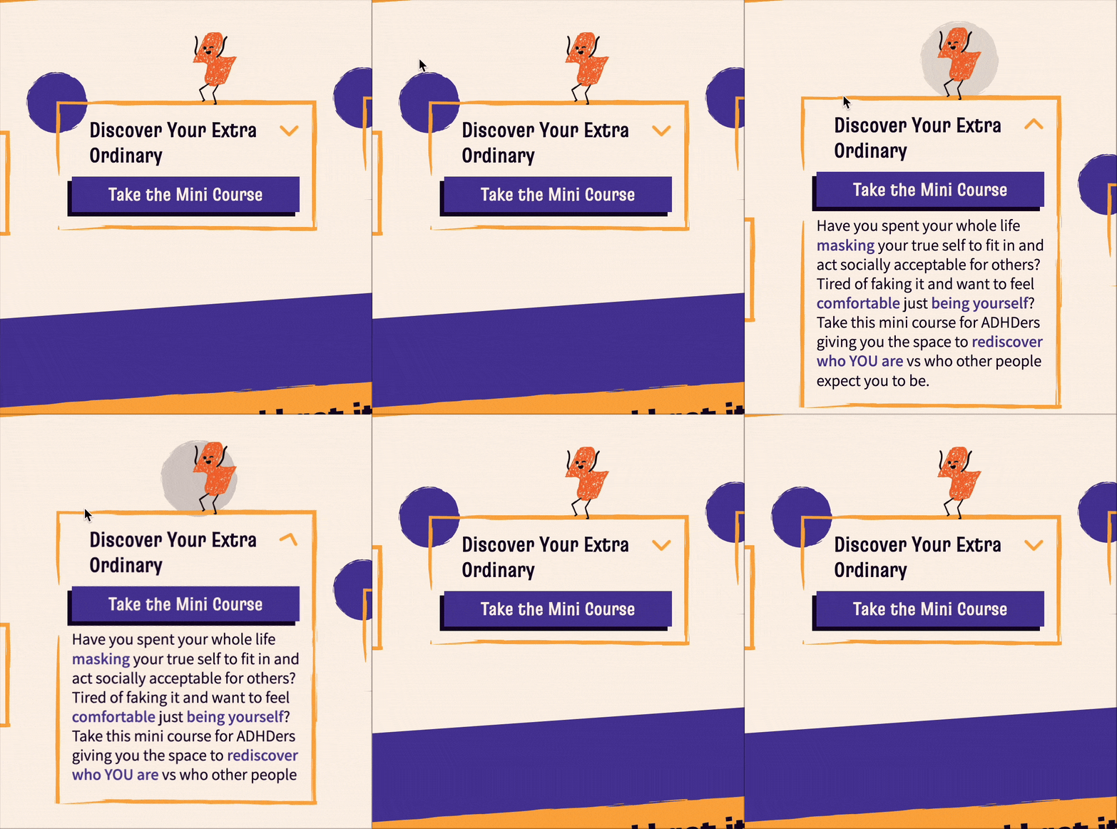


As part of a website overhaul to match the new branding, I implemented custom animations and interactions in Webflow, intentionally made to feel satisfying and keep visitors engaged by fidgeting with them.
Brand Application

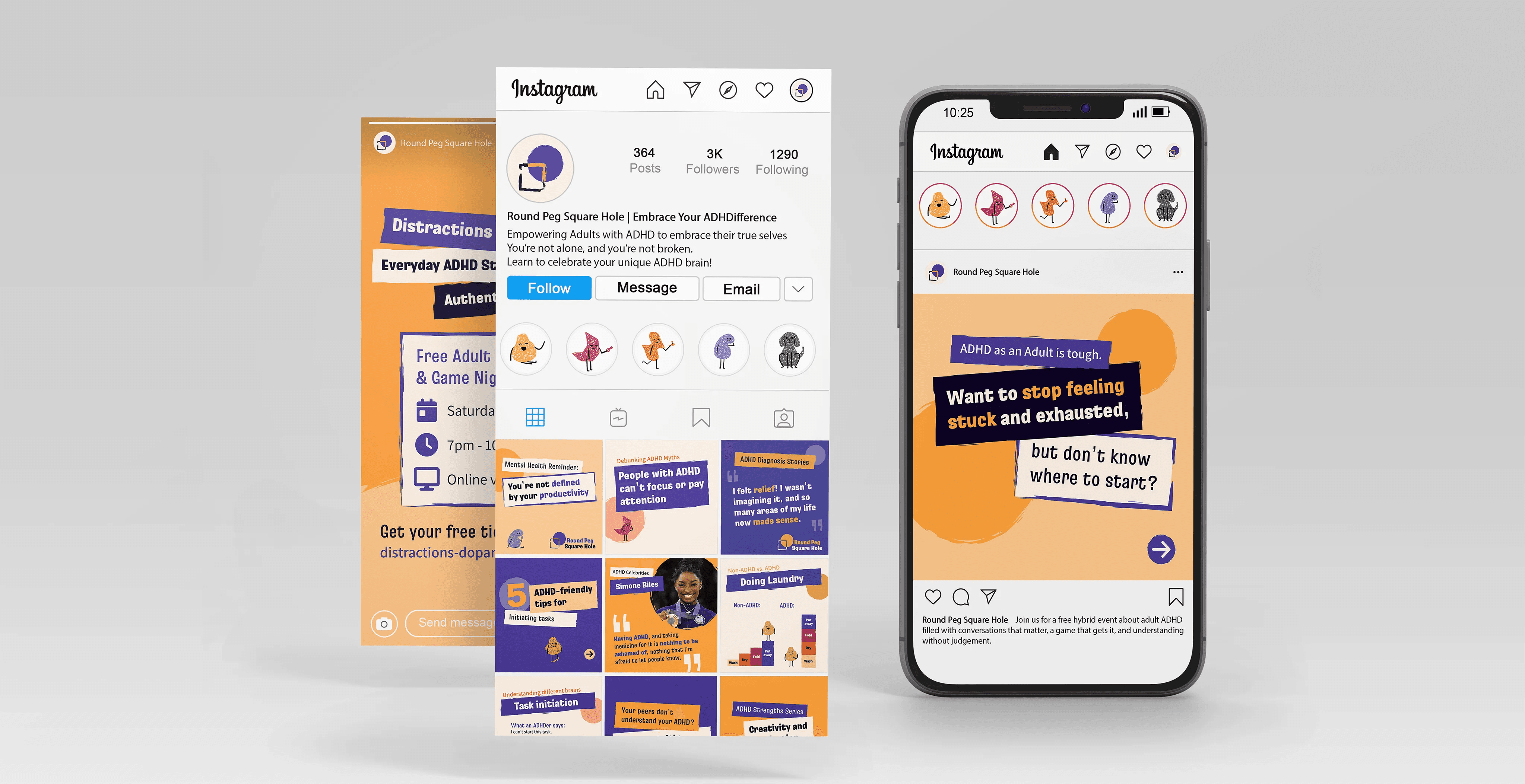
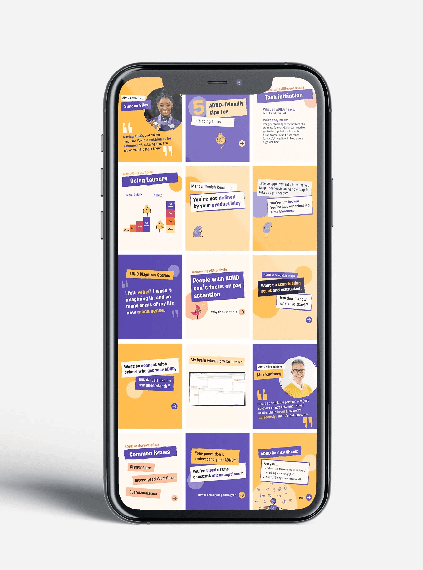
I also established a cohesive social media strategy by creating branded, editable post templates including carousel posts and weekly repeatable post series. The content was focused on relatability and humour, education, and actionable help to attract new audiences, keep them engaged, and convert them into long-term community members.

In order to encourage sign-ups for an email newsletter, I designed a desk calendar as a downloadable freebie to print at home. Instead of adhering to a classic structure with a box for each day, it embraces fluidity and provides an adaptable space to use for notes, doodles, or vision boards.
Round Peg
Square Hole
Branding
Social Media
Advertising
Web Design
Content Strategy
Illustration
Over the course of multiple freelance projects, I established a cohesive visual appearance and distinct brand identity for 'Round Peg Square Hole', aimed at helping adults with ADHD embrace their uniqueness. I created marketing materials for social media, print and digital applications with strategic insights, leading to an increase in audience reach, engagement and membership sales.
Challenge
Adults with ADHD in the UK face long wait times for diagnosis, limited support, and widespread stigmatisation. My client founded ‘Round Peg Square Hole’ (or RPSH) after her own late diagnosis to help others like her, but struggled reaching her target audience with a limited budget. The core challenge was creating a brand identity that stood out from established, big organisations.
Insight
My competitor audit revealed that most organisations target a broad audience and communicate with authority to improve education and awareness. RPSH instead focuses on those discovering their ADHD later in life, who have experienced lifelong struggles and issues with self acceptance. The brand needs to serve as an understanding safe space, helping them feel at home in an authentic community.
Impact
A confident appearance, deeply rooted in the founder’s personal experiences, makes this audience feel directly spoken to rather than about. The brand identity was built around humour, chaos and self-acceptance, and served as a foundation for future projects like the launch of a paid community-membership, a monthly newsletter, and a conceptualised board game launch event.
The final logo and claim communicate a key insight behind the brand's name and approach: Those with ADHD feel like they are round pegs in a society made of square holes, as if they cannot fit in without being forced to change or hide parts of themselves. Round Peg Square Hole wants to challenge this societal idea that ADHD needs to be ‘fixed’ and instead focuses on embracing the uniqueness of those affected.
Brand Identity
Bonus illustration of the founder's dog
To further separate RPSH from the clinical and impersonal approach of most competitors, we decided to include mascots with distinct personalities resembling common experiences of people with ADHD. I illustrated them in Procreate, taking care to balance a scribbled and creative appearance with legibility of facial expressions.
Colours, typography and shape language were all chosen to reinforce this authentic appeal of boldly embracing imperfections and creativity. The business cards I designed show this in the use of rough shape edges, slightly slanted headlines, and elements being cut off by the edges of the cards. All shapes used in the brand appearance also stem from the original circle and square from the logo for further cohesion and recognisability.
As part of a website overhaul to match the new branding, I implemented custom animations and interactions in Webflow, intentionally made to feel satisfying and keep visitors engaged by fidgeting with them.
Brand Application
I also established a cohesive social media strategy by creating branded, editable post templates including carousel posts and weekly repeatable post series. The content was focused on relatability and humour, education, and actionable help to attract new audiences, keep them engaged, and convert them into long-term community members.
In order to encourage sign-ups for an email newsletter, I designed a desk calendar as a downloadable freebie to print at home. Instead of adhering to a classic structure with a box for each day, it embraces fluidity and provides an adaptable space to use for notes, doodles, or vision boards.
Round Peg
Square Hole
Branding
Social Media
Advertising
Web Design
Content Strategy
Illustration
Over the course of multiple freelance projects, I established a cohesive visual appearance and distinct brand identity for 'Round Peg Square Hole', aimed at helping adults with ADHD embrace their uniqueness. I created marketing materials for social media, print and digital applications with strategic insights, leading to an increase in audience reach, engagement and membership sales.
Challenge
Adults with ADHD in the UK face long wait times for diagnosis, limited support, and widespread stigmatisation. My client founded ‘Round Peg Square Hole’ (or RPSH) after her own late diagnosis to help others like her, but struggled reaching her target audience with a limited budget. The core challenge was creating a brand identity that stood out from established, big organisations.
Insight
My competitor audit revealed that most organisations target a broad audience and communicate with authority to improve education and awareness. RPSH instead focuses on those discovering their ADHD later in life, who have experienced lifelong struggles and issues with self acceptance. The brand needs to serve as an understanding safe space, helping them feel at home in an authentic community.
Impact
A confident appearance, deeply rooted in the founder’s personal experiences, makes this audience feel directly spoken to rather than about. The brand identity was built around humour, chaos and self-acceptance, and served as a foundation for future projects like the launch of a paid community-membership, a monthly newsletter, and a conceptualised board game launch event.
The final logo and claim communicate a key insight behind the brand's name and approach: Those with ADHD feel like they are round pegs in a society made of square holes, as if they cannot fit in without being forced to change or hide parts of themselves. Round Peg Square Hole wants to challenge this societal idea that ADHD needs to be ‘fixed’ and instead focuses on embracing the uniqueness of those affected.
Brand Identity
To further separate RPSH from the clinical and impersonal approach of most competitors, we decided to include mascots with distinct personalities resembling common experiences of people with ADHD. I illustrated them in Procreate, taking care to balance a scribbled and creative appearance with legibility of facial expressions.
Colours, typography and shape language were all chosen to reinforce this authentic appeal of boldly embracing imperfections and creativity. The business cards I designed show this in the use of rough shape edges, slightly slanted headlines, and elements being cut off by the edges of the cards. All shapes used in the brand appearance also stem from the original circle and square from the logo for further cohesion and recognisability.
As part of a website overhaul to match the new branding, I implemented custom animations and interactions in Webflow, intentionally made to feel satisfying and keep visitors engaged by fidgeting with them.
Brand Application
I also established a cohesive social media strategy by creating branded, editable post templates including carousel posts and weekly repeatable post series. The content was focused on relatability and humour, education, and actionable help to attract new audiences, keep them engaged, and convert them into long-term community members.
In order to encourage sign-ups for an email newsletter, I designed a desk calendar as a downloadable freebie to print at home. Instead of adhering to a classic structure with a box for each day, it embraces fluidity and provides an adaptable space to use for notes, doodles, or vision boards.