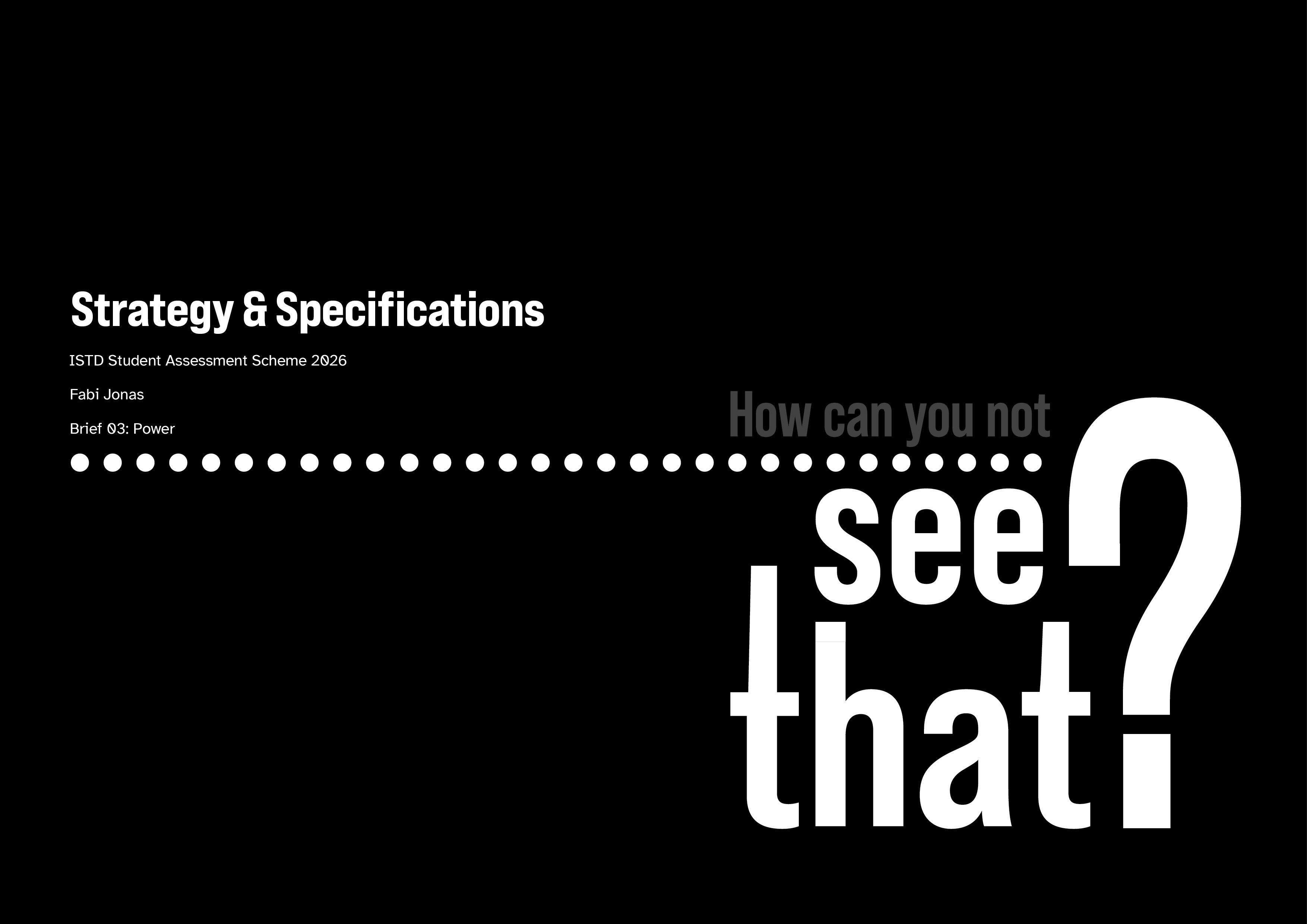
How can you not see that?
Typography
Editorial
Bookbinding
Interactivity
Accessibility
Photography
Interactions with colour blind people from my family and social circle have shown me many life areas affected by colour vision deficiencies that I, even as a designer interested in accessibility, would never have thought of. This publication, submitted to the ISTD Student Assessment Scheme 2026 under the Brief ‘Power’, uses interactive sliders and tactile elements to expose the real-life implications of living with a colour vision deficiency to promote awareness and understanding of the issue.

Challenge
Research revealed that a majority of affected people experience daily problems, but subconscious coping mechanisms mean their social environment is often not aware of how much power it can hold over their life. This dismissal creates invisible power imbalances, leading to negative interactions and a lack of accessibility.
Insight
Existing efforts to increase awareness often merely simulate what impaired colour vision looks like, or consist of textbook rules to follow, struggling to highlight the real impact. Actual improvements to accessibility instead often stem from open dialogues with affected individuals, creating an emotional connection and intrinsic motivation.
Impact
Flip Through Video


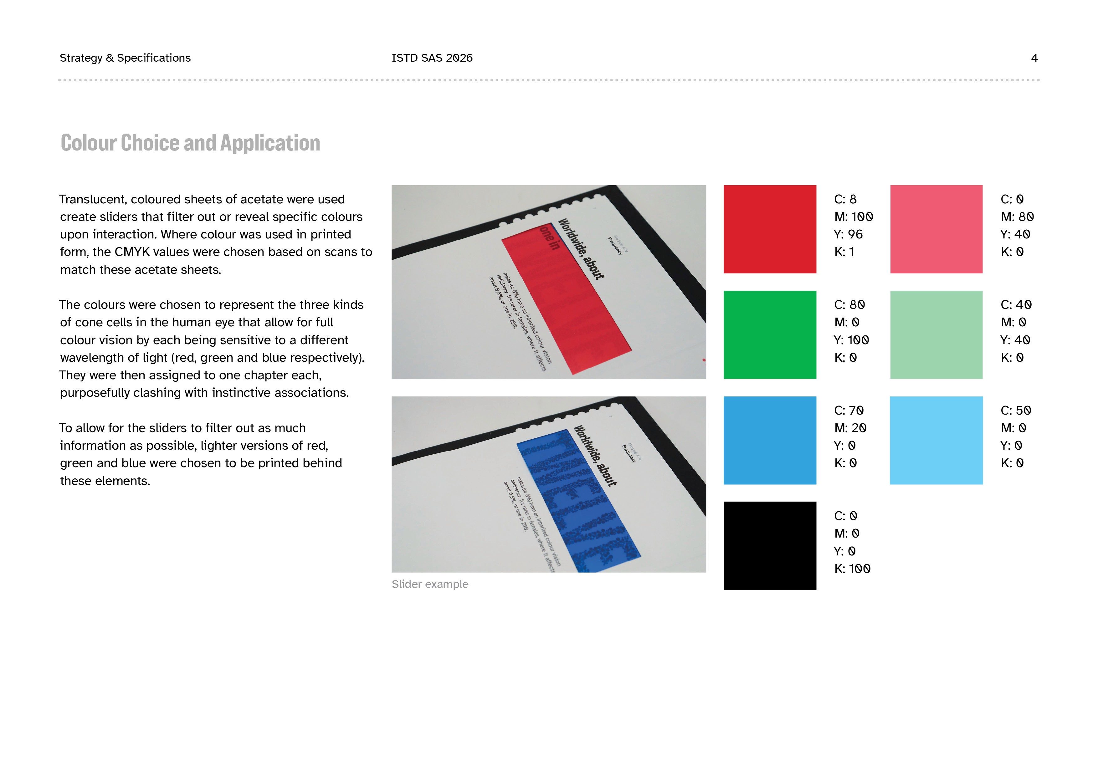
As the core interactive elements of this project, the sliders went through many prototypes, user tests and iterations. To avoid readers pulling the wrong tabs, indents were added, which help identify the correct slider for each page.
Sliders


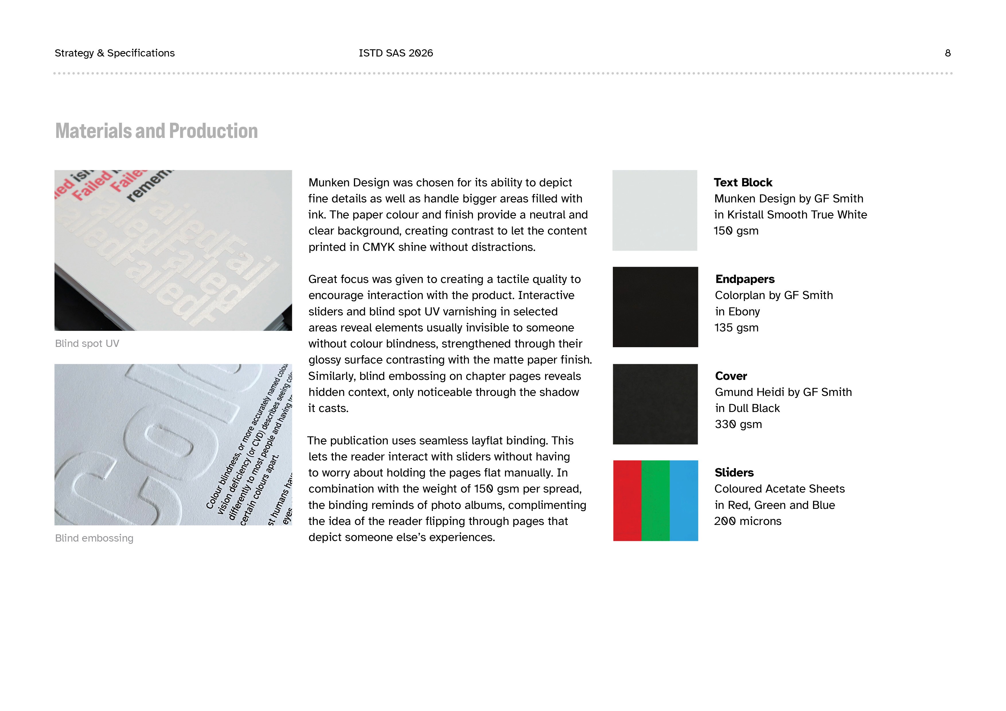
With die-cut paper letters on the cover, hand-embossed type on chapter pages and layered vinyl to emulate UV Blind Spot, I was able to integrate additional elements that invite physical interaction and reveal further context upon close investigation.


Tactile Details


Subtle details were implemented to improve the reading experience. In reference to the use of Braille in navigational systems, the publication uses dots in the cover margins to help guide the reader. Each chapter is assigned one of the three chosen colours as its main accent, while a dot overview at the top of each spread communicates reading progress. Lastly, patterns of dots in randomised sizes remind of the classic Ishihara tests to detect colour vision deficiencies and further guide the viewer's eyes across each page.


Navigation & Structure

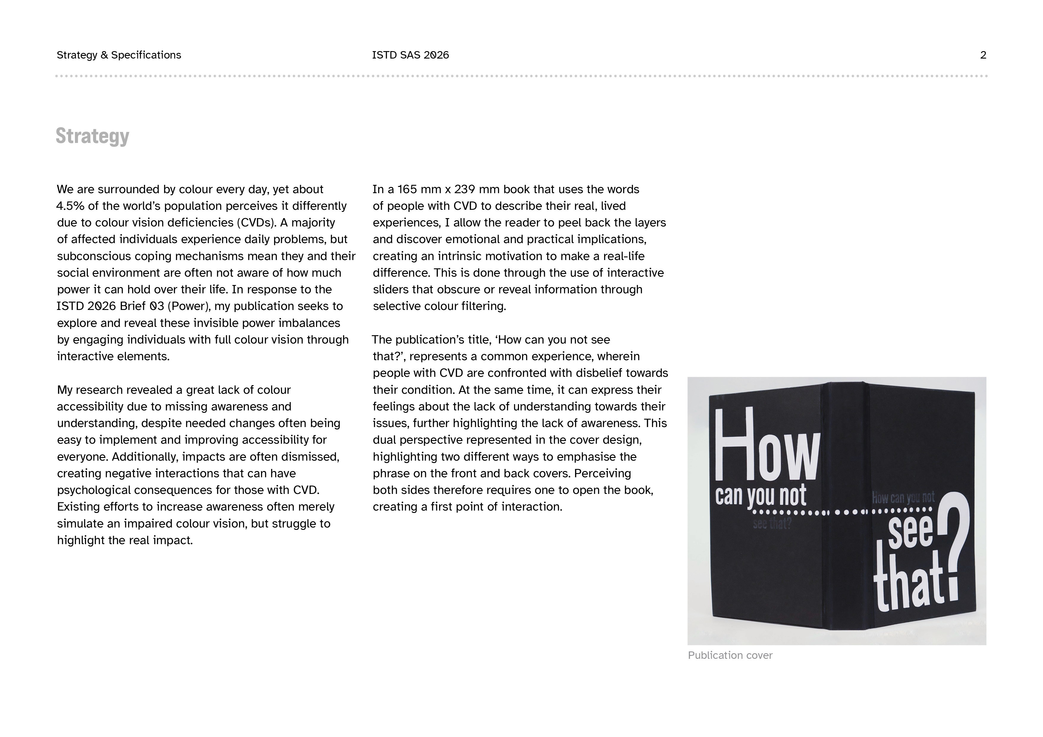
The title was chosen for its ability to be interpreted differently from the perspective of someone with colour blindness vs. the perspective of someone who doesn’t understand it. This duality is represented in the design. Perceiving both sides of the cover requires one to open the book, which creates a first point of interaction.

Cover Design
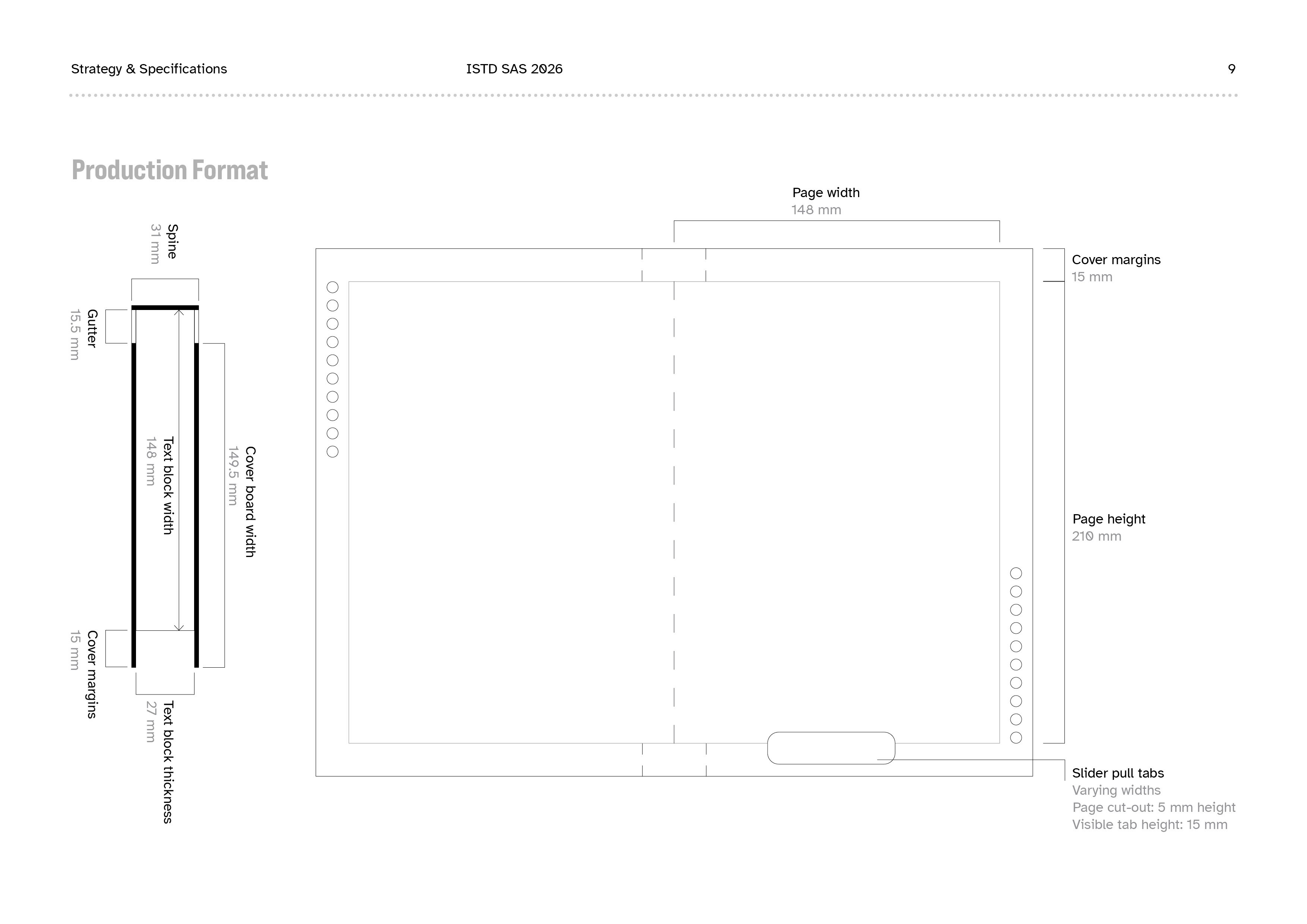
As this project was submitted to the ISTD Student Assessment Scheme, I created a document detailing strategy, layout, and typographic decisions. You can click on the thumbnails to view the pages in fullscreen!